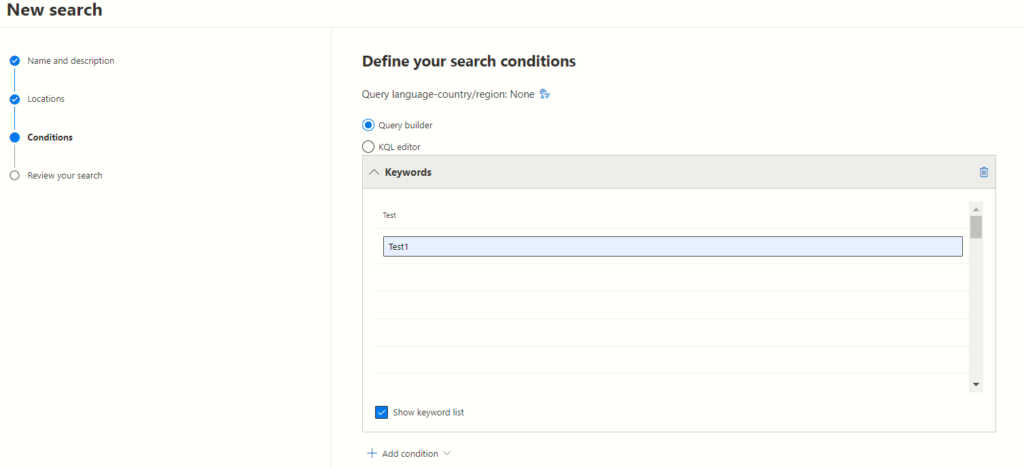
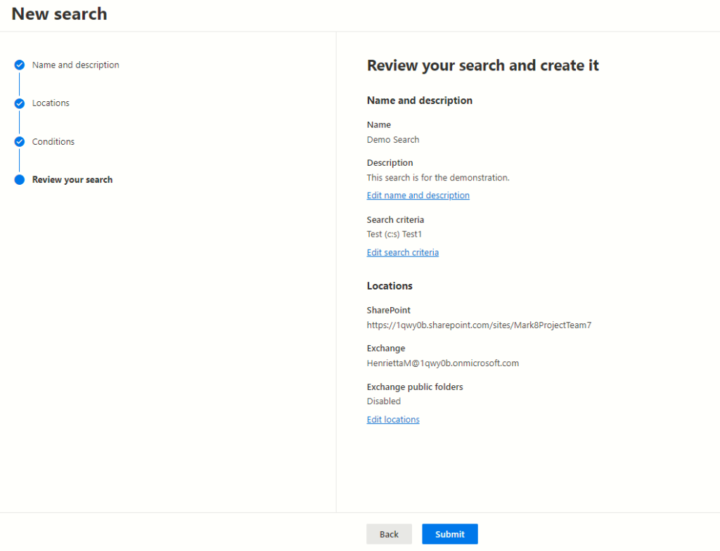
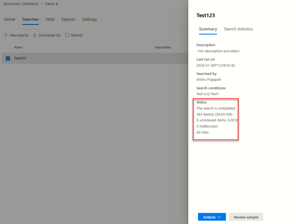
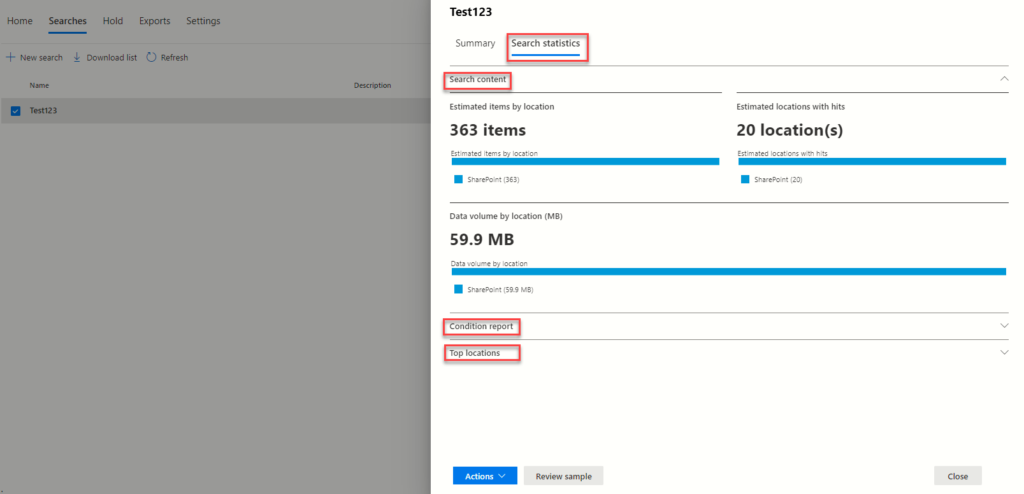
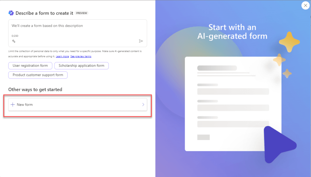
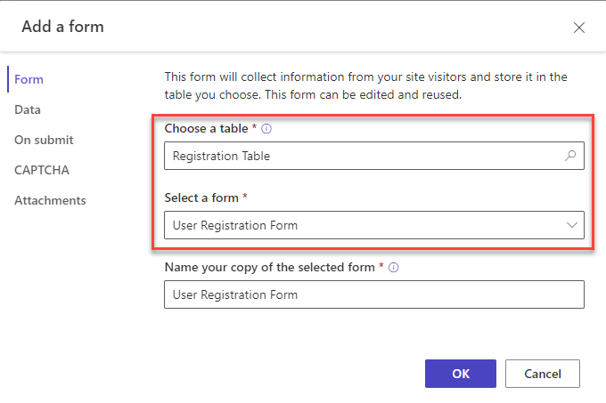
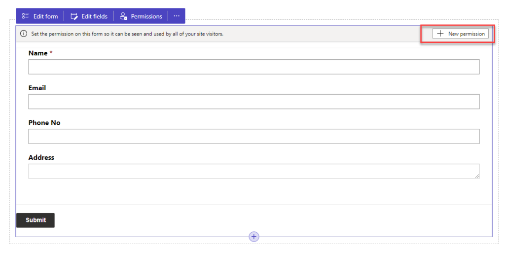
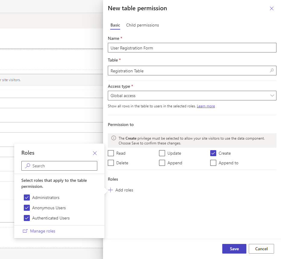
Unlocking the Power BI: A Deep Dive into Power BI Semantic Models

Ever wonder what makes Power BI so effective for data analysis? The secret lies in Semantic Models. These models are the foundation of Power BI, transforming raw data into clear insights for smarter decisions.

This blog post dives into what Semantic Models are and how they work. You’ll learn how they:

Connect your data: Combine information from different sources.
Simplify complex data: Make it easier to understand and analyze.
Empower decision-making: Get the insights you need to take action.

By understanding Semantic Models, you can harness the full power of Power BI and turn data into a driver for success.

What is a Semantic Model?

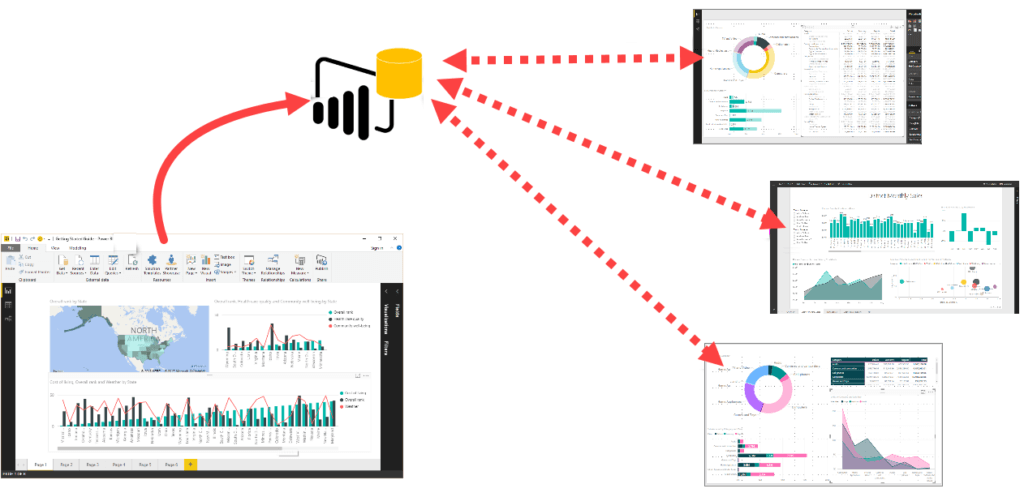
Imagine Power BI reports and dashboards as the final presentation, but what goes on behind the scenes? That’s where Semantic Models come in.

These models act as a translator, taking your raw data and organizing it for clear understanding. They connect different data sources, define key relationships, and perform calculations – essentially, cleaning up the mess and making it easier to analyze.

Think of it like a map for your data. Semantic Models establish clear connections and hierarchies, allowing users to explore information intuitively. This translates to smoother user experience, consistent data interpretation, and ultimately, more confident decision-making based on accurate insights.

In short, Semantic Models bridge the gap between raw data and clear visualizations, unlocking the full potential of Power BI for data exploration and analysis.

img

Types of Semantic Models

Power BI offers three types of Semantic Models to cater to different data needs and preferences:

1. Import Model:

Best for: Fast performance and offline analysis.

Details: Data is copied and stored within the Power BI file, enabling quick visualizations.
Consideration: Requires regular data refreshes to stay up-to-date.

2. DirectQuery Model:

Best for: Real-time data access and large datasets.

Details: Connects directly to the data source, eliminating storage needs within Power BI.

Consideration: Performance might be slightly slower compared to Import Model.

3. Composite Model:

Best for: Combining speed and real-time updates.

Details: A flexible approach that allows storing frequently used data (Import) and connecting to live data sources (DirectQuery) for specific tables.

Advantage: Optimizes performance based on the type of data being analyzed.

Choosing the Right Model:

For fast analysis and offline use, Import Model is ideal.
For massive datasets requiring constant updates, DirectQuery shines.
When you need both speed and real-time elements, Composite offers the best of both worlds.
Guide to Building Power BI Semantic Models

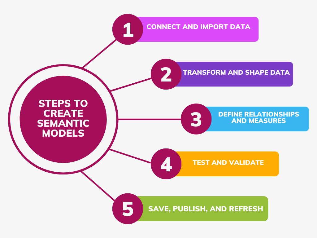
Here’s a comprehensive guide to building effective Semantic Models:

1. Connect and Import Data:

Establish a connection between Power BI and your data sources.

Import relevant data based on your chosen model (Import or DirectQuery).

2. Transform and Shape Your Data:

Utilize Power Query Editor to clean, transform, and organize your data for optimal analysis.

3. Define Relationships and Measures:

Create clear connections between different data tables within your dataset.

Leverage DAX language to define insightful measures and calculations that reveal hidden trends.

4. Test and Validate Your Model:

Build sample reports and visualizations to ensure your model accurately reflects the desired insights.

5. Save, Publish, and Refresh (for Import Model):

Save your Power BI file for future use.

Publish it to the Power BI service for collaboration.

Schedule data refreshes (Import Model only) to maintain up-to-date information.

img

By following these steps, you can build robust Semantic Models that empower clear data exploration and insightful decision-making in Power BI.

Semantic Model Ownership

Who Can Edit Your Power BI Semantic Model?

Think of your Semantic Model as a shared workspace. Only the owner has permission to make changes. If you access a model through a gateway or cloud connection and see a “read-only” message, it means you’re not the owner.

To edit the model, you can either:

Collaborate with the Owner: Discuss the changes you need and work together.
Become the Owner: If necessary, request ownership from the current owner to make edits directly.
This ensures clear ownership and prevents accidental modifications by unauthorized users.

Conclusion

These models organize your data, making it easier to understand and analyse. They act as a bridge between raw data and clear insights, giving you the power to make data-driven decisions. Think of them as translators for your data, simplifying complex information for better decision-making.

Copilot in Action Create Your Site Through AI Innovation


How to use copilot in power pages

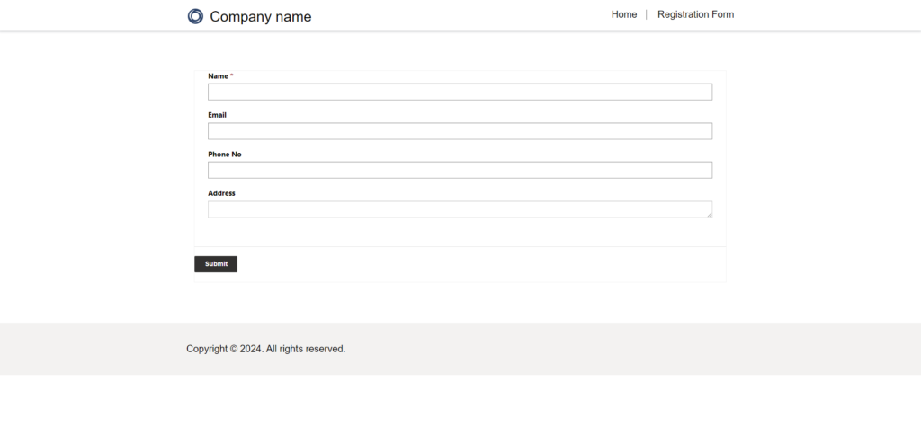
Make use of Copilot’s features when creating websites with Power Pages. AI will help you create your website depending on your description. Use natural language processing to inform the AI about the goals of the website, who the intended audience is, and what content or features it should have. This streamlines the design process by enabling AI to generate a customized website based on your requirements using natural language commands.

With Copilot, we can make sitemaps, homepages, themes, and layouts quickly. Copilot also suggests relevant content, images, and themes based on how users interact. It helps users explore new ideas and make more creative and effective websites.

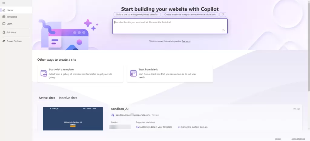
Create a power pages site using Copilot

Step 1: Navigate to Power Pages by accessing the following
URL: ‘https://make.powerpages.microsoft.com/’.

Step 2: Describe the type of website you intend to create. For instance, specify whether it’s an e-commerce platform, a blog, a portfolio site, or any other specific concept.

img

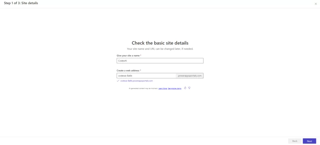
Step 3: After entering the desired site name and web address into the provided fields. Once entered, click on the “Next” button to proceed with the site creation process.

img

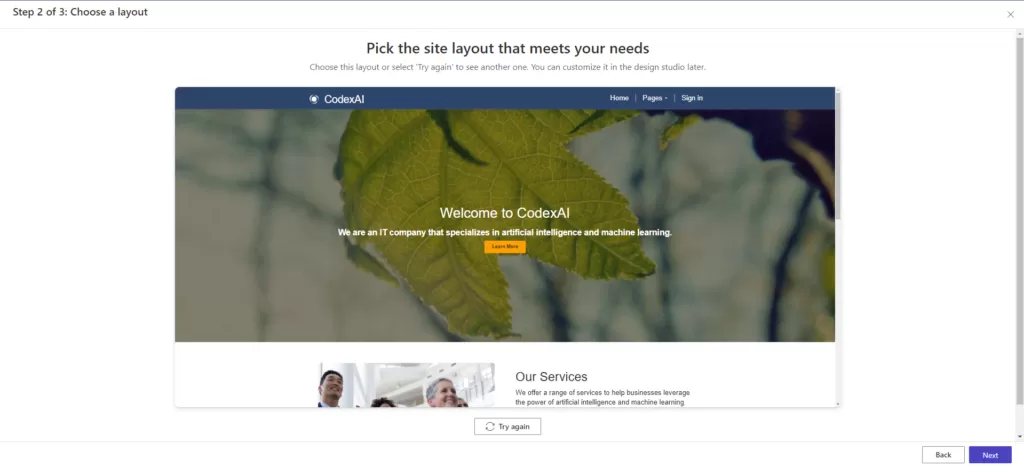
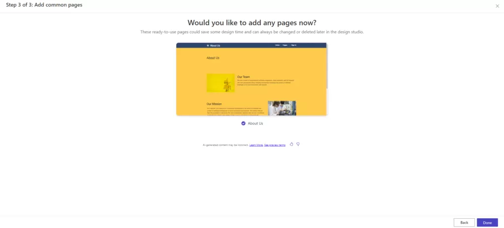
Step 4: The AI Copilot embedded in Power Pages will automatically create the homepage based on the information you’ve provided. Additionally, you have the flexibility to expand your site’s content by adding more pages according to your requirements.

img

img

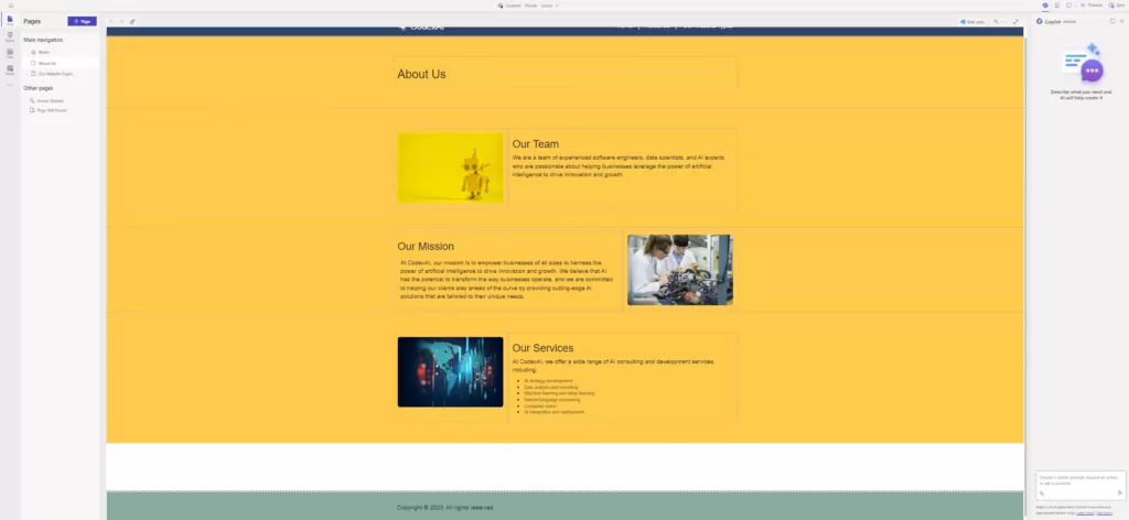
Step 5: After clicking ‘done,’ the site will be automatically created within 5 minutes. We will be able to view the homepage and other added pages, such as ‘About Us.’ Then, we can customize and add things based on our requirements.

img

img

Step 6: If the user wants to create another page using Copilot, they need to enter details about that page. afterward, Copilot will create the page. Also, we can change the site theme using Copilot.

img

Conclusion

Building a Power Pages website using Co-Pilot was a smooth and rewarding experience. Co-Pilot’s AI made things much easier, helping create a lively and attractive website. With Co-Pilot’s assistance, the site has complete information, simple navigation, and a beautiful look. Using this advanced tool has boosted how appealing the website is. By following Co-Pilot’s suggestions, we’ve set the stage for a strong and impactful online presence.

Comprehensive Guide to Error-Handling in Power Automate

Significance of Error-Handling

In automation, mistakes can occur. These errors might happen because the data format changes, there are connection problems, or external services aren’t available. So, it’s important to have good ways to deal with errors in your automated processes. This ensures they keep working well and can be relied upon.

One important part of making strong automated processes in Power Automate is handling errors properly. This blog post will talk about the best practices for dealing with errors in Power Automate.

Error-Handling Standards in Power Automate

1. Incorporating Try-Catch-Finally

Power Automate allows you to incorporate error handling by using certain actions within the flow. Although there isn’t a direct “try-catch-finally” construct, you can effectively handle errors using a combination of actions.
Here’s how you can implement error handling:

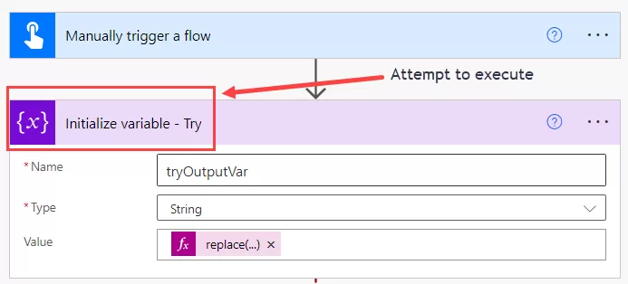
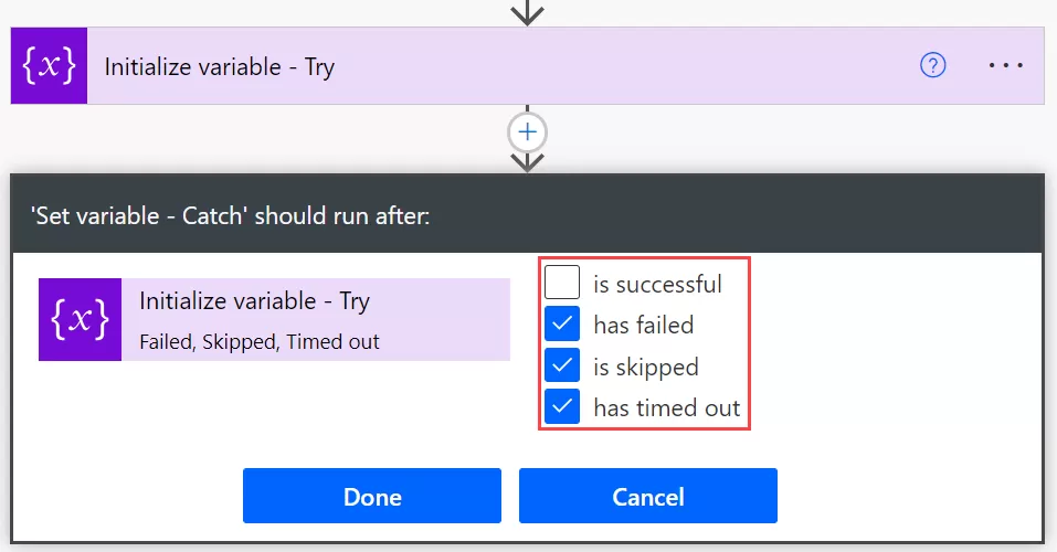
Start by retrieving data from a list and then initialize variable to encapsulate the subsequent actions as a “try” block.


img-01

Include an action to set a variable and configure its ‘Run After’ settings by selecting the options ‘has failed,’ ‘is skipped,’ and ‘has timed out.’ This action will function as the ‘catch’ block.

img-02

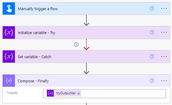
If an error occurs within the ‘try’ block, causing any of the selected conditions in the ‘Run After’ settings of the set variable to trigger, the flow will then proceed to execute the ‘catch’ block.

img-3

Within the “catch” block, you can handle the error appropriately. Once the “catch” block executes successfully, you can proceed with any final actions needed to complete the flow.

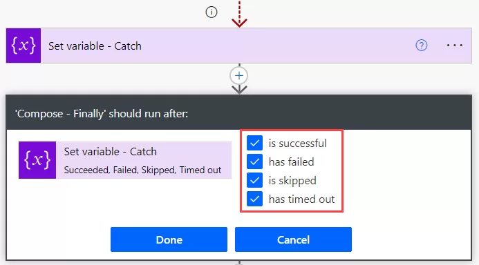
Add a compose action to function as a ‘finally’ block, configuring it with all selections from the ‘configure run after’ settings.

img-4

img-5

By structuring your flow in this manner, you can effectively handle errors that may occur during its execution.

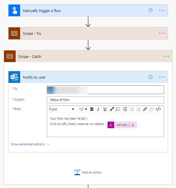
2. Utilizing Try-Catch in scope actions

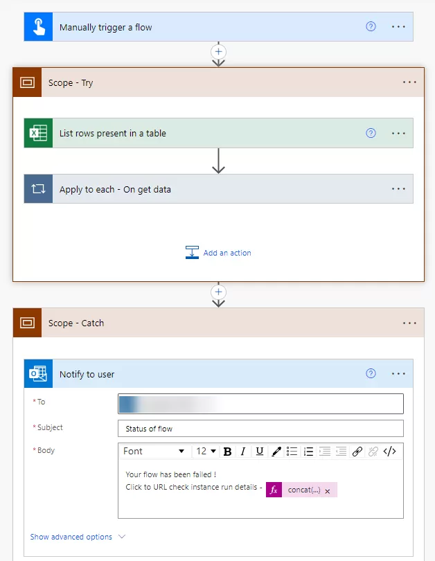
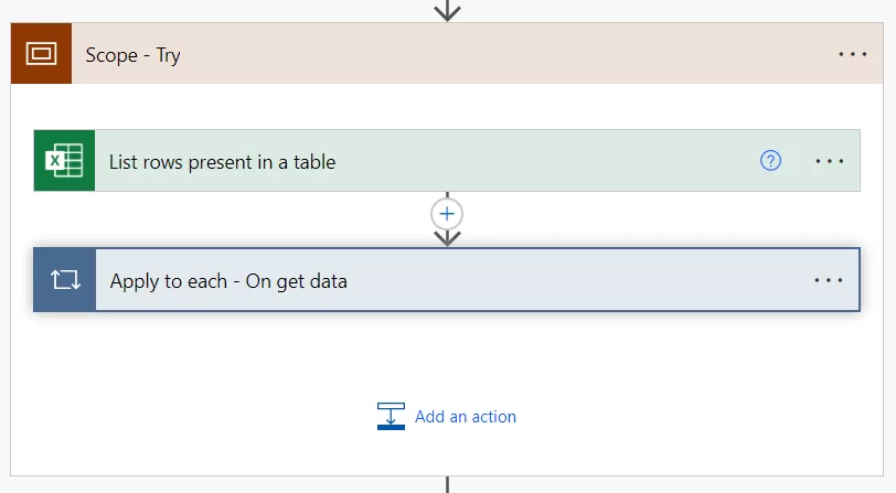
A collection of actions is encapsulated within the “Scope Try” action, serving as a container. Its primary purpose is to execute these actions cohesively while vigilantly monitoring for potential errors. This mechanism allows the flow to seamlessly transition to the “Scope Catch” block if an error arises within the “Try” scope, ensuring a smooth error-handling process.

Now, let’s employ an Excel action to retrieve rows from a table and include additional steps within the scope, as illustrated below.

img-6

The “Scope Catch” action in Power Automate serves as an error-handling block, seamlessly managing and recovering from errors occurring within the associated “Scope Try” action.

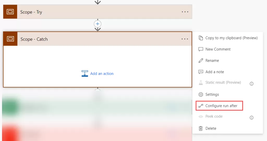
To enhance the error-handling mechanism, add another scope action control and access the “Configure run after” option.

img-7

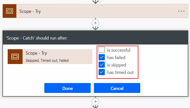
In the “Configure run after” selection, choose “has failed,” “has been skipped,” or “has timed out,” as depicted below.

img-8

Scope Try in Power Automate organizes actions neatly, preventing flow failure from “Try” block errors and enabling integration with Scope Catch for error handling. Scope Catch aids in structured error management, preventing unexpected failures, logging errors, and facilitating action implementation, enhancing overall flow reliability and resilience.

img-9

The “Flow Run History URL” in Power Automate serves as a valuable tool for error handling. It offers a clickable link that leads to detailed information about the specific flow run that experienced an error.


concat('https://us.flow.microsoft.com/manage/environments/',workflow().tags.environmentName,'/flows/',workflow().name,'/runs/',workflow().run.name)

img-10

In summary, it’s crucial to implement proper error-handling techniques when building workflows in Power Automate. Following the guidelines mentioned in this blog post ensures that your workflows can gracefully handle errors and maintain smooth operation.

The key to effective error handling in Power Automate is to anticipate and be prepared for potential failures. Always have a plan in place to address any issues that may arise during the workflow execution.

How to Create the Reusable Header Using Component?

What is component?

Components are reusable building elements for canvas apps in PowerApps that include one or more controls. Complex capabilities can be enabled by components by utilizing sophisticated features like custom attributes.

Scenario

Assume for the moment that our application will have more than two screens and that we must display a header and footer. Therefore, in this scenario, it will be challenging to maintain the header and footer on each screen if we are not utilizing components. If we need to make any changes—for example, to the font size, title, or logo—we will have to travel through all screen windows. We may make this as a component and use it on different screens to avoid these repeating modifications.
Creating Application

Step 1: Open the Browser and pate the URL: https://make.powerapps.com/.

Step 2: Click “Apps” in the left panel.

Step 3: Click on the “New app”.

img-01

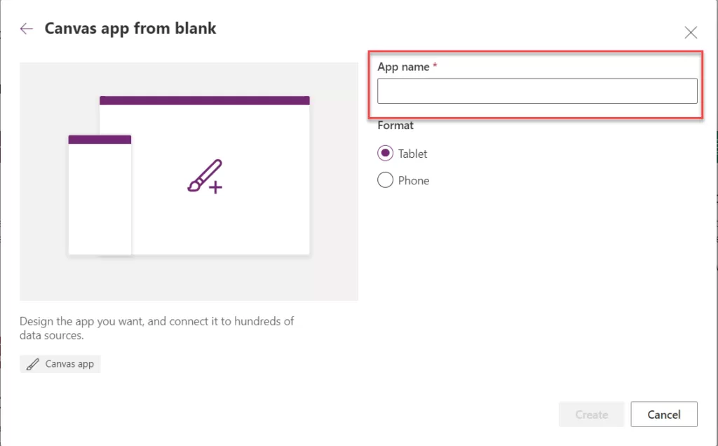
Step 4: Choose the Blank Canvas app and enter the app’s name as it appears in the image below:

img-02


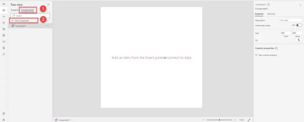
Step 5: Once the app is created, you will notice the component option is visible.

Step 6: Click on the Component tab after the screen as show into the below.

Step 7: Click on the “+ New Component” button and new component will be added to the component screen.

All the above step as show into the below image.


img-03

Step 8: Rename “Component1” to “Header Component” and adjust the “With” property.

Step 9: Currently, the component has a height and width of 640. To decrease the height, set it to 25, and observe the reduced component height as shown below:

img-04

Step 10: To display the screen name, you can insert a text label. If you require a home or back icon or any other elements, you can add and arrange them according to your preferences.

Step 11: For a responsive header, utilize a container control. Incorporate relevant buttons or labels into the header based on your specific requirements.

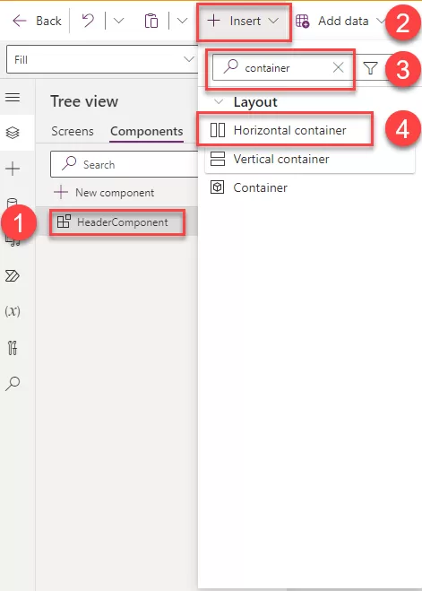
Step 12: Add a Horizontal container to your component by clicking on “Insert,” searching for the container control, and adding it.

img-05

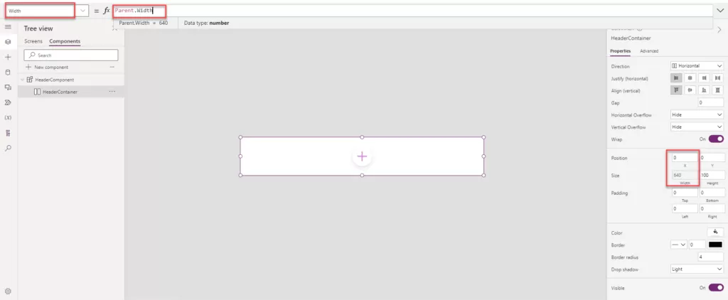
Step 13:  Once you’ve added the Horizontal Container, adjust the width and X property according to your specific requirements.

  • Width: Parent. Width
  • X: 0

img-06

Step 14:  Insert the text label and home icon inside the horizonal container. In the horizontal container all the control which are added into this container is side by side so we can easily rearrange accordingly.

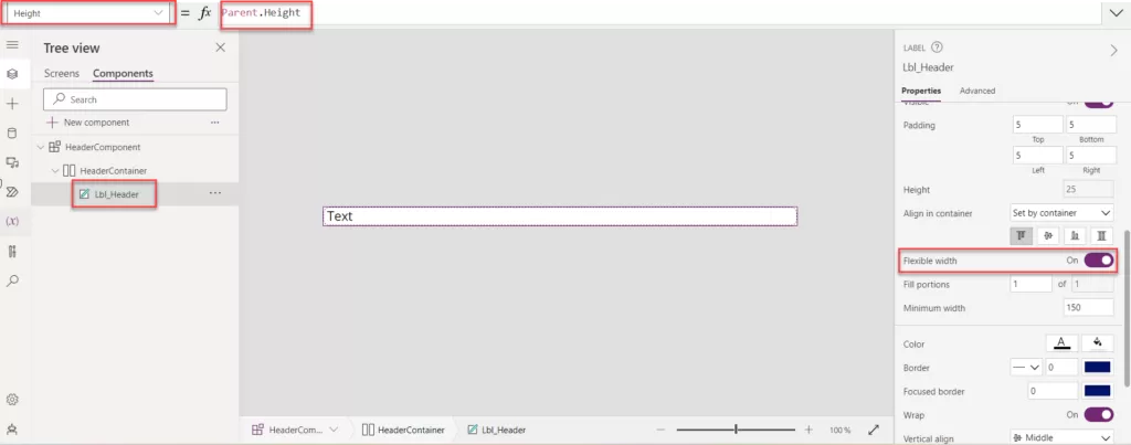
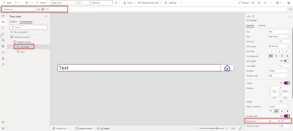
  • Add the text label into the container and change the text label name to “Lbl_Header”.
  • Enable the flexible width option for the Lbl_Header.
  • Also change the height property set as: Parent. Width.

img-07

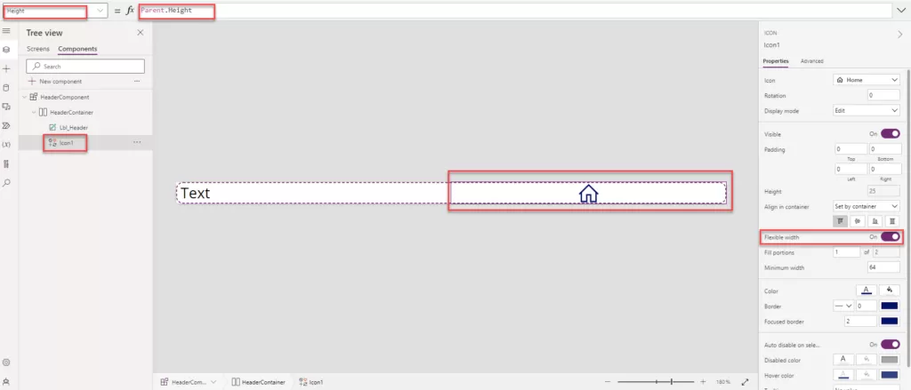
  • Insert the home Icon into horizontal container.
  • Enable the Flexible width to turn on.
  • Ser the height: Parent. Height.

img-08

Step 15: You can select the label and adjust the “Fill Portions” based on your specific requirements.

  • Fill Portions is: 36.
  • Fill Portions: Defines how the individual component grows when there is more screen real-estate assigned to its parent. The number represents the portion of the extra space given to the component out of all the available extra space claimed by children of its parent. For example, if child A has Fill portions set to 1 and child B has Fill portions set to 2, child A gets 1/3 of the extra space available while child B gets 2/3 of the extra available space.

img-09

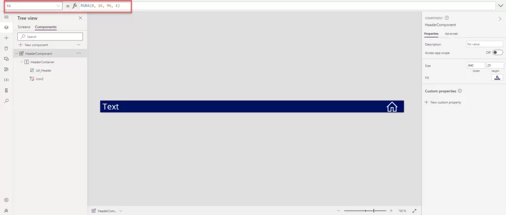
Step 16: Apply the background color to the component to set the header color. Adjust the font color for “Lbl_Header” and “Icon2” based on the background. In our case, we’ve set the text color to white, and the “HeaderComponent” background color is dark blue.

img-10

Step 17: Now that our header component is ready, we can configure the custom properties for Text, Screen, and Fill color, as displayed on the right side.

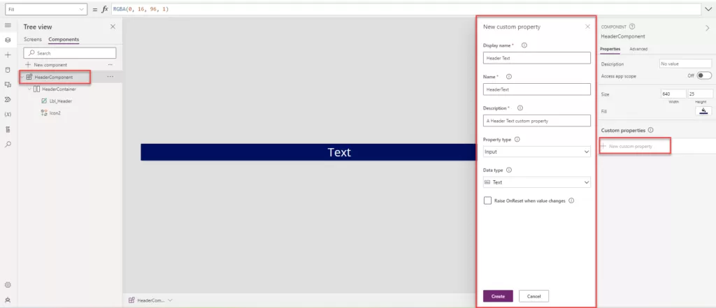
Step 18:  Custom properties: A component can receive input values and emit data by creating one or more custom properties.

  • In the Display name, Property name, and Description boxes, add information according to your requirements.
  • Display name: Header Text
  • Property name: HeaderText

Note: Ensure that you do not include spaces when providing the Property Name, as this name will be used as a reference.

img-11

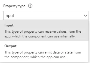
Step 19:  The Property type has two options: one is called input, and the other is called output, as shown in the image below.

img-12

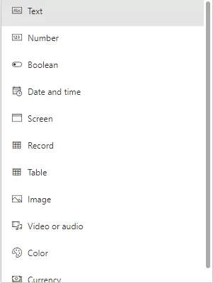
Step 20: Various types of custom properties can be created, including Text, Number, Boolean, Date and Time, Screen, Record, Table, Image, Video or Audio, Color, and Currency.

img-13

Step 21: In our case, where we need to change the screen header based on requirements, we select “Text” as the data type. Click on “Create” to add the Custom Properties.

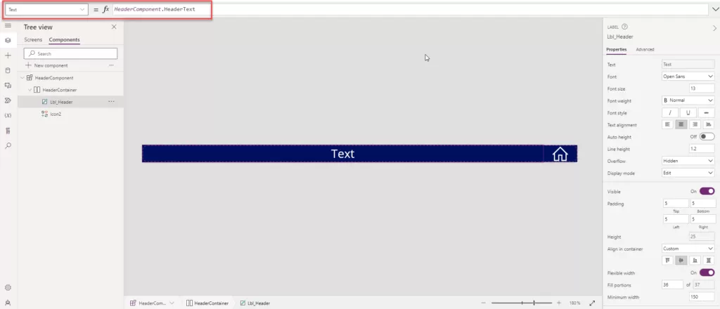
Step 22: Add the text property of “Lbl_Header” to “HeaderComponent.HeaderText”

img-14

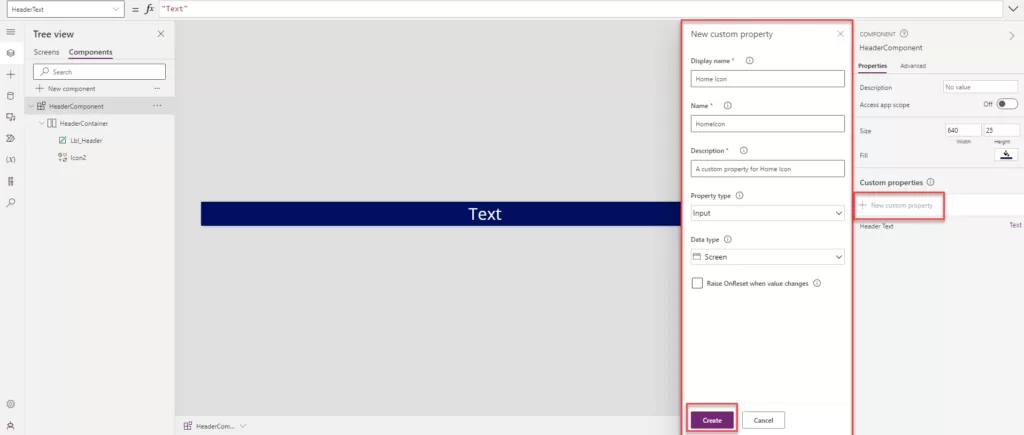
Step 23: Now, create a new property for navigating the screen.

  • Click on “New Custom Property.”
  • Add the Display Name: Home Icon.
  • Name: HomeIcon.
  • Description: A custom property for Home Icon.
  • Data type: Screen.
  • Click on the create button.

img-15

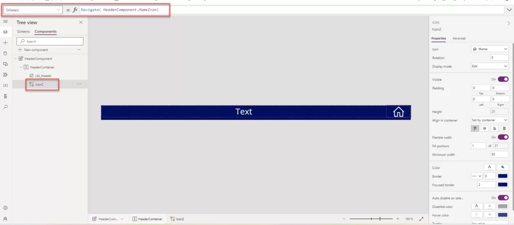
Step 24: Now, add the following formula to the icon’s “On Select” event. In our case, we want to use the Home Icon to navigate to the home screen. Select the icon and add the formula as mentioned below:

  • On Select: Navigate (HeaderComponent.HomeIcon)

img-16

Step 25: Now, our component is ready to be added to the header of the screen in Power Apps. Click on the right side of the “Screen” option.

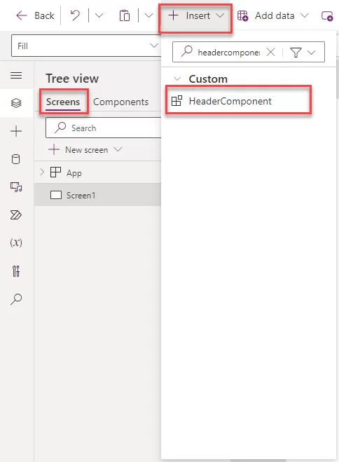
Step 26: Click on “Insert” and search for the component name, then add it to the screen.

img-17

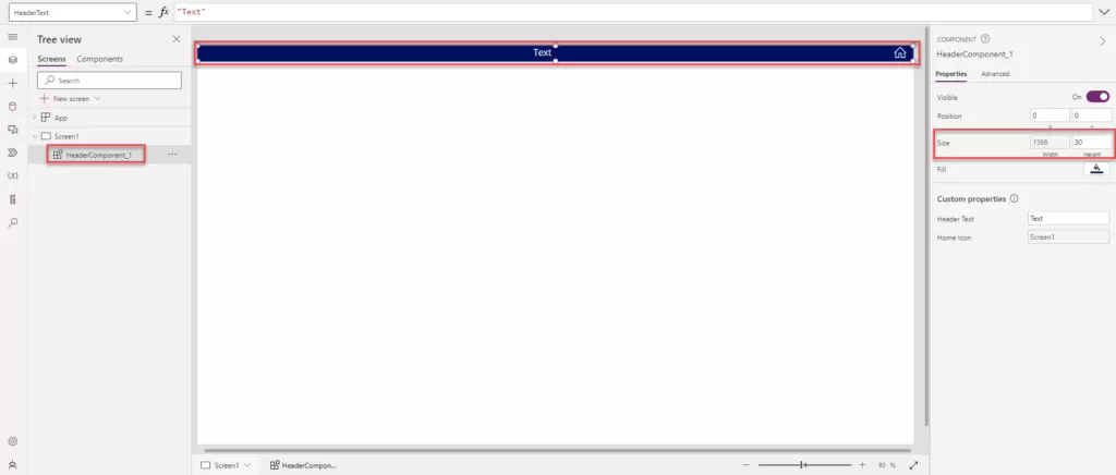
Step 27: Now, set the component width and height according to the requirements on the screen. In our case, the width is set to Parent. Width, and the height is set as 30.

img-18

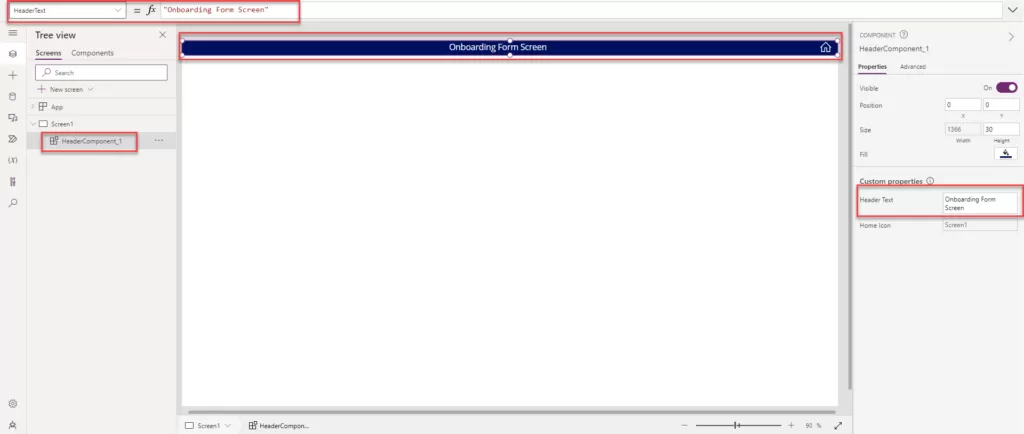
Step 28: Now, to change the header name, select the header control and go to the right side in the component Custom property.

  • Click on “Header Text.”
  • Provide the text you want to display as the screen header. In our case, we have added “Onboarding Form Screen” as the text.

img-19

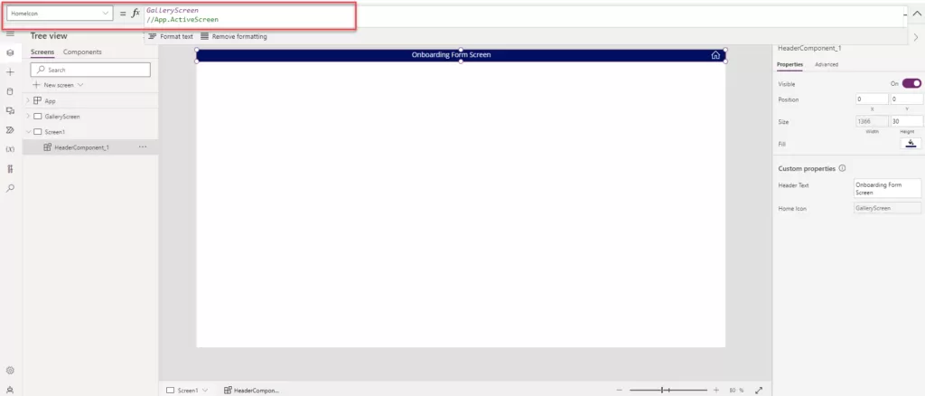
Step 29: To change the functionality of the home icon, follow the same steps as above for changing the header text. Additionally, you can add the screen name that you want to navigate to when the user clicks on the home icon. You can implement the logic in the On Select action to achieve the desired navigation.

img-20

Step 30: All the above process same as you can create the new screen and add the header component.

Refresh Dataset for Power Bi Report Using Power Automate

Power Automate, a service by Microsoft, presents a valuable feature that facilitates the refreshing of datasets utilized in Power BI reports. This functionality proves especially beneficial when the data source undergoes frequent changes, necessitating the report to reflect the most recent data accurately.

The “Refresh a dataset” action in Power Automate offers versatility, allowing it to be triggered based on various conditions, ensuring flexibility in keeping Power BI reports up to date. Users can initiate this action either manually or schedule it to run at specific times.

Furthermore, Power Automate seamlessly integrates with Power BI reports, providing the option for on-demand dataset refreshments. This integration is achieved through the incorporation of a Power Automate button directly within the report.

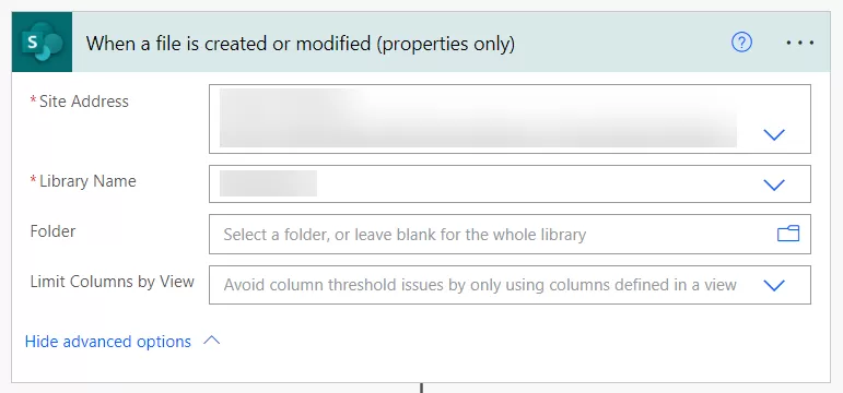
Step 1: Let’s set up a Power Automate flow using the “When a file is created or modified” trigger. In this step, carefully choose the “Site Address” and “Library Name” corresponding to the location of your spreadsheet, where further modifications are anticipated. This trigger is essential as it retrieves data from the spreadsheet linked to your PowerBI live report.

img-01


Step 2: Add the PowerBI action “Refresh a dataset” and specify the “Workspace” where your PowerBI report is created. Additionally, select the corresponding “Dataset” associated with the report. This ensures the seamless refreshing of the specified dataset within your PowerBI environment.

img-02


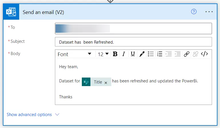
Step 3: Include the “Send an email” action to notify when the dataset has been refreshed. This action will be triggered whenever there is a modification in the spreadsheet, leading to the dataset being refreshed, followed by a notification.

img-03


In summary, Power Automate emerges as a robust and flexible solution for maintaining the currency of Power BI reports by facilitating regular updates of the underlying datasets.

Part – 2 Make Power Apps Ootb Form Control Responsive Using Containers

Follow these steps to set up the form responsiveness:

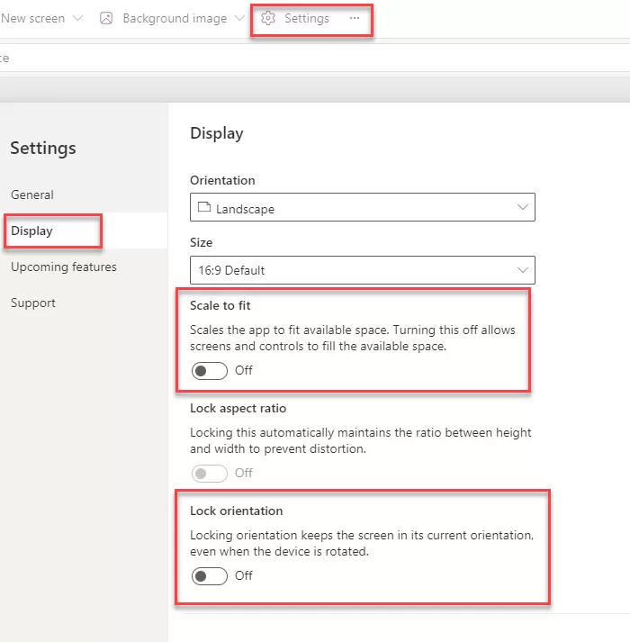
  1. Open the power apps and click on the setting.
  2. Go into the display settings and turn off the “Scale to fit” feature. Make sure that “Lock Orientation” and “Lock Aspect ratio” are disabled.

img-01


Responsive Form with Form controls.

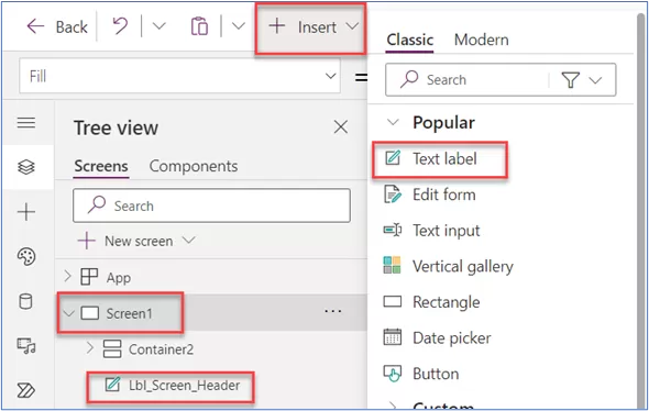
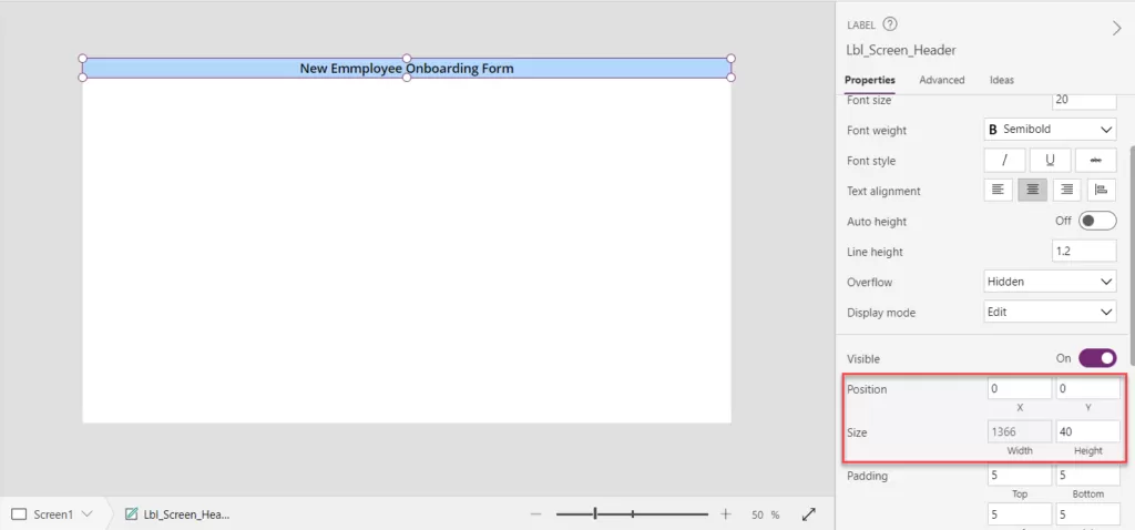
Step 1: Click on the “Insert” icon and add the Text label property as shown in the below image. And Adjust label name according to the requirement and adjust the height and width of the label. Also changes the text as per the requirement.


img-02

img-03

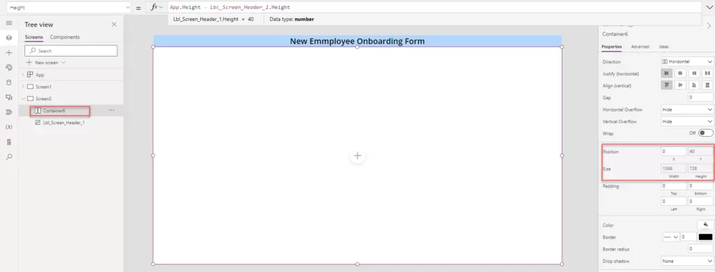
Step 2: Create a new blank screen and insert a horizontal container onto the screen. Set the container’s height to match the previous specifications. In this method, the horizontal container is directly added as we’re utilizing Power Apps’ default form control.

  • Width:Width
  • Height:Height – Lbl_Screen_Header_1.Height


img-04


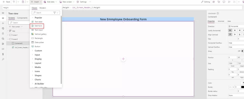
Step 3: Click on the “Insert” button and select the “Edit form” option, following the image reference provided. Ensure that you choose the Horizontal container and subsequently place the form inside this container.


img-05


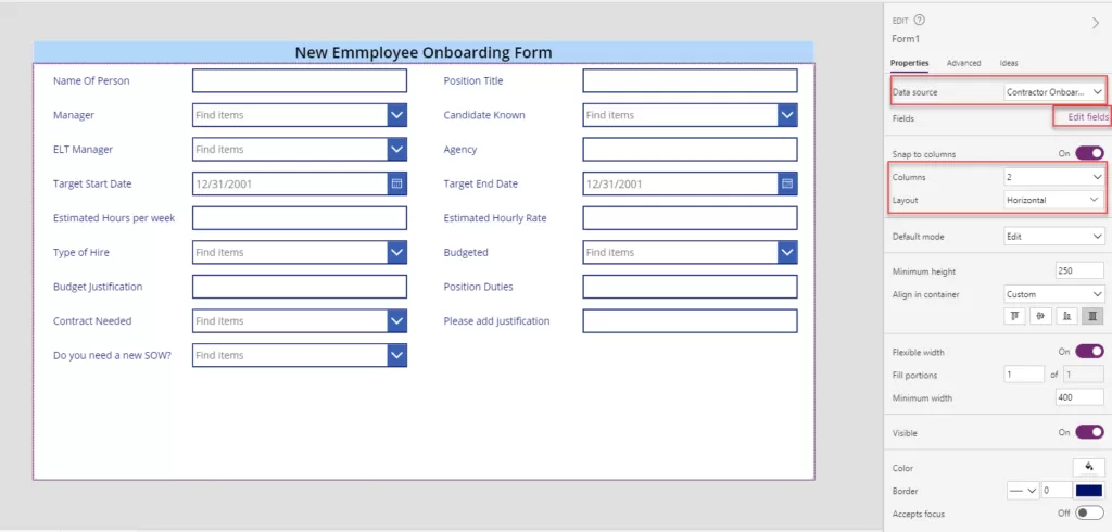
Step 4: After adding the form and linking it with the data source, modify the form’s properties by setting the number of columns to 2 and choosing a horizontal layout. If you wish to omit certain fields or rearrange their order, access the “Edit fields” option located in the image below.


img-06


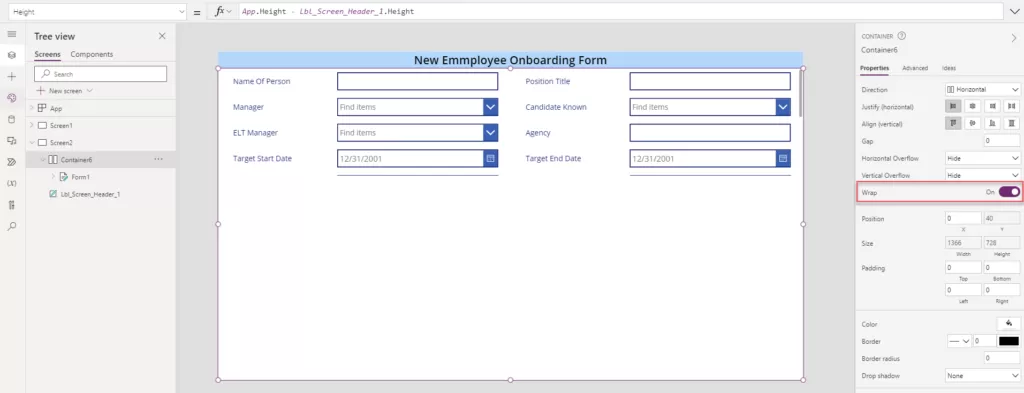
Step 5: Enabling the “Wrap” control for the form will result in the appearance depicted in the image below. This occurs due to the form’s minimum height being set to 250. To utilize the entire form space, a formula can be applied.


img-07


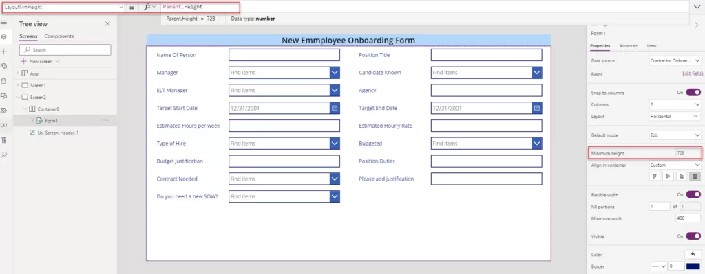
Step 6: Let’s incorporate the logic for the form’s minimum height by including the specified height within the formula provided below.

  • LayoutMinHeight: Parent.Height


img-08


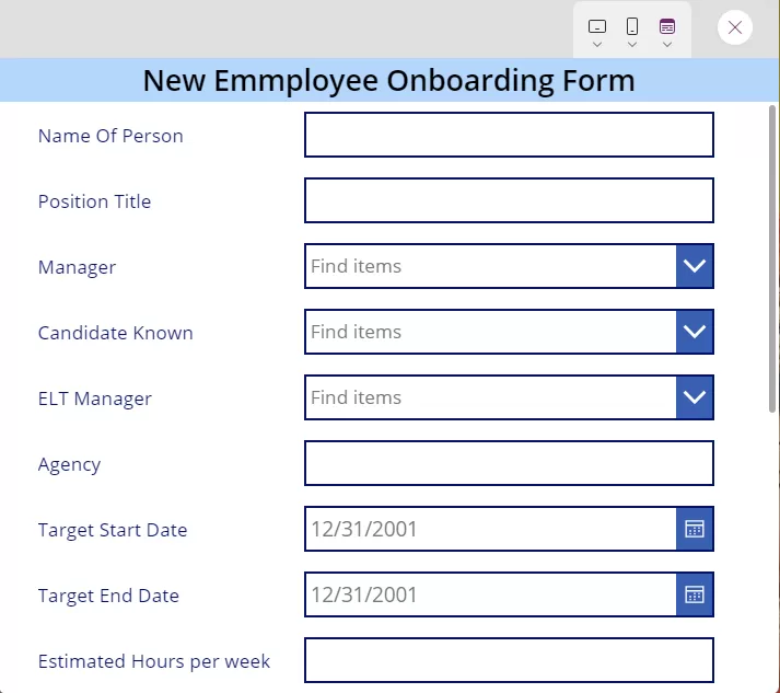
Step 7: Upon minimizing the browser window, observe how all controls automatically adapt and adjust according to the screen size, ensuring optimal responsiveness.


img-09


Part – 1 Make Power Apps Custom Controls Form Responsive Using Containers

What is the responsive Power App form?

Responsive Power App forms are made to be viewed and interacted with on a variety of devices, offering a consistent and intuitive user experience irrespective of screen size or quality. This is achieved using features and design strategies. Usually, responsive design concepts and Power Apps’ ability to dynamically optimize the form layout are used to achieve this adaptability.

Essential Steps for Implementing Responsive Applications

Follow these steps to set up the form responsiveness:

1. Open the power apps and click on the setting.

2. Go into the display settings and turn off the “Scale to fit” Make sure that “Lock Orientation” and “Lock Aspect ratio” are disabled.


img-01


Responsive Form with individual controls.

Step 1: Click on the “Insert” icon and add the Text label property as shown in the below image. And Adjust label name according to the requirement and adjust the height and width of the label. Also changes the text as per the requirement.


img-02

img-03


Step 2: Select the “Insert” button displayed in the image below and opt for the Vertical Container.

  • We utilize the vertical container to arrange all controls sequentially, facilitating the submission of records into the data source. This arrangement allows for multiple controls to be organized vertically on the screen, enabling a smoother process for submitting records.


img-04


Step 3: Adjust the container’s X and Y position according to specific requirements. This flexibility allows for customization based on individual needs. Set the following steps based on your unique requirements.

  • X position is 0
  • Y Position is Lbl_Screen_Header.Y +Lbl_Screen_Header.Height

img-05


Step 4: Adjust the width and height of vertical container to fit the entire screen area. Ensure that the height and width adjustments align with the screen dimensions for optimal utilization.

Width: App.Width

Height: App.Height – Lbl_Screen_Header.Height


img-06


Step 5: Place a horizontal container within the vertical container to build the form with labels followed by text inputs in two parallel columns. This design will allow labels to be displayed side by side with text input areas, thus generating two columns within the form.

  • When the horizontal container is added within the vertical container, it has the same width and height as the vertical container. Disable the Flexible Height option and provide a specific height based on our requirements. Set the height to 80 in this example to meet our specific needs.
img-07


Step 6: Insert a label named “Employee Name” and a text input field for the employee’s name within the horizontal container.

  • Adjust the label control properties as below.
  • Flexible Width: Turn On.
  •  Align in Container: Custom and Stretch.
  • Ensure that for the label, the flexible width is enabled, and align it within the container by stretching it to match the container’s height, as illustrated in the provided image. Additionally, add another label named “Position Title” along with its respective text input, aligning them accordingly within the container.
  • While adding the text label, ensure the selected option for alignment within the container is set to “Stretch.” For all text input controls,


img-08


  • While adding the text input label, ensure the selected option for alignment within the container is set to “Center.” For all text input controls.

img-09


Step 7: Apply left and right padding to the container according to the desired outcome, ensuring that all controls are centered. Utilize the gap property to adjust the controls uniformly. Upon applying the Wrap property enable, the controls might shift upwards; thus, adjust the vertical alignment to center them based on the image provided.

  • Padding Left and Right: 30
  • Wrap toggle: On
  • Align (Vertical): Center

img-10


Step 8: Implement logic for the height of the horizontal container based on screen sizes denoted by specific numbers:

  • Mobile: Size 1
  • Tablet: Sizes 2 and 3
  • Desktop: Size 4

The current static height provided for Container 3 is 80. Adjust the logic for the horizontal container’s height considering these screen size specifications.

1| If(Screen1.Size<4,Lbl_EmployeeName.Height +TextInput_EmployeeName.Height +Lbl_PositionTitle.Height+Txtinput_PositionTitle.Height + 35,80)

img-11


Step 9: Upon minimizing the browser window, observe how all controls automatically adapt and adjust according to the screen size, ensuring optimal responsiveness.


img-12


Step 10: To incorporate additional controls like the ones above, insert another horizontal container within the primary vertical container. Subsequently, add corresponding labels and text inputs as per your specific requirements to maintain consistency with the existing setup.


img-13

Connecting to SharePoint Online using Managed Identity

When automating tasks in Microsoft 365, it’s best to avoid logon IDs and passwords.

The best practice is to use the least privileges and function in a zero-trust environment.

The ideal approach is to use a Managed Identity with the Sites.

Selected application scope, some approaches use a Sites.

Selected scope with an App Registration and Service Principal, but the best approach is to use Managed Identities for identity management in automation.

Approach 1: Connecting to SharePoint Online using Managed Identity with Granular Access Permissions

Microsoft Graph and SharePoint Online support some granular access permissions using Sites.

Selected application scope in Graph and app access role permissions in Site collections. It even works with Managed Identities.
The Sites selected application scope was added to Microsoft Graph a while back to enable granular app access permissions within SharePoint Online.

With this scope, one can grant application access to specific SharePoint Online site collections instead of granting access to all site collections in the tenant.

Managed Identities is a way of providing identities to Azure resources without any App credentials like certificates or client secrets involved.

The prerequisites:

Needed the following resources for setup:

  • A Logic App with a System Assigned Managed Identity.
  • A SharePoint Site with a SharePoint list populated with a few columns and items.
  • Access to grant Microsoft Graph application scopes and SharePoint site permissions.
A Logic App with a System-assigned Managed Identity:

Once the System assigned Managed Identity is enabled on the Logic App, Note down the Object (principal) ID for the Managed Identity (guid e8800382-610d-4761-9b15-873065e53227) – which will be used to grant Sites. Selected application scope in Microsoft Graph.

Blog-Post-01-02

Blog-Post-01-03

Visiting the Enterprise Application blade in the Azure AD Portal, select the recently created Managed Identity object and noted down the Application ID for the Managed Identity (guid 827fc69f-2814-44d7-96bc-492f2bf21c83) – which will be used to grant permission within the SharePoint site.

Application Id

Create a Team site with the name Test Team Site, which generated a SharePoint site, and added a SharePoint List with the name OrderList with necessary columns and a few items.

Grant Application Scope in Microsoft Graph

Use Microsoft Graph PowerShell SDK to grant the Sites. Selected application scope in Microsoft Graph.

$ObjectId is set to the guid value of Object (principal) ID for the Managed Identity noted down earlier.
 
# Add the correct ‘Object (principal) ID’ for the Managed Identity

$ObjectId = “e8800382-610d-4761-9b15-873065e53227”
 
# Add the correct Graph scope to grant

$graphScope = “Sites.Selected”
 
Connect-MgGraph -Scope AppRoleAssignment.ReadWrite.All
 
$graph = Get-MgServicePrincipal -Filter “AppId eq ‘00000003-0000-0000-c000-000000000000′”
 
$graphAppRole = $graph.AppRoles | ? Value -eq $graphScope
 
$appRoleAssignment = @{
 
    “principalId” = $ObjectId
 
    “resourceId”  = $graph.Id
 
    “appRoleId”   = $graphAppRole.Id
 
}
 
New-MgServicePrincipalAppRoleAssignment -ServicePrincipalId $ObjectID -BodyParameter $appRoleAssignment | Format-List
 
Running the Powershell code produced the following output in the console, indicating that the scope was successfully granted.
 
AppRoleId: 883ea226-0bf2-4a8f-9f9d-92c9162a727d
 
CreatedDateTime: 14.02.2022 07:45:10
 
DeletedDateTime:
 
Id: 9Uv0TSLb…Yw3xRUH8
 
PrincipalDisplayName: test-team-site-automation
 
PrincipalId: e8800382-610d-4761-9b15-873065e53227
 
PrincipalType: ServicePrincipal
 
ResourceDisplayName: Microsoft Graph
 
ResourceId: 07165e04-89b3-4996-8b1d-a2a225eb5104
 
AdditionalProperties: {[@odata.context, https://graph.microsoft.com/v1.0/$metadata#servicePrincipals(‘e8800382-610d-4761-9b15-873065e53227’)/appRoleAssignments/$entity]}
 
The Managed Identity now has the Sites.
 
Selected application scope in Microsoft Graph, but still requires app access within the specific SharePoint site.
 
Grant App Access to a Specific SharePoint Site
Microsoft Graph PowerShell SDK to grant the Managed Identity app access to the SharePoint site.
 
id in the application hashtable is set to the guid value of Application ID for the Managed Identity noted down earlier.
 
# Add the correct ‘Application (client) ID’ and ‘displayName’ for the Managed Identity

$application = @{
 
id = “827fc69f-2814-44d7-96bc-492f2bf21c83”
 
displayName = “test-team-site-automation”
 
}
 
# Add the correct role to grant the Managed Identity (read or write)

$appRole = “write”
 
# Add the correct SharePoint Online tenant URL and site name

$spoTenant = “tenant.sharepoint.com”
 
$spoSite  = “TestTeamSite”
 
# No need to change anything below

$spoSiteId = $spoTenant +:/sites/+ $spoSite +:”
 
Import-Module Microsoft.Graph.Sites
 
Connect-MgGraph -Scope Sites.FullControl.All
 
New-MgSitePermission -SiteId $spoSiteId -Roles $appRole -GrantedToIdentities @{ Application = $application }

Running the Powershell code produced the output of a permission ID in the console, indicating that the permission was successfully granted.

The Logic App’s Managed Identity should now have enough permissions to both read and write the SharePoint List items via Microsoft Graph.

Configure Logic App to Retrieve SharePoint List Items

I went back to the Logic App and the Logic app designer blade and added a new action step.

  • Connector: HTTP
  • Method: GET
  • URI: https://graph.microsoft.com/v1.0/sites/<tenant>.sharepoint.com:/sites/TestTeamSite:/lists/OrderList/items?$select=id,webUrl,fields,createdDateTime&$expand=fields($select=Title,Owner,Description,AutomationCompleted)&$top=999
  • Authentication
    • Authentication type: Managed Identity
    • Managed identity: System-assigned managed identity
    • Audience: https://graph.microsoft.com

Save the new configuration and triggered the Logic App. And behold – status code 200 and a response body with the list items!

Blog-Post-01-05

Success! The Logic App is able to work with data in SharePoint Online sites authenticating with its least-privileged Managed Identity, but only for sites it is specifically granted app access to.

Now you know how to utilize Sites. Selected application scope and app access roles in SharePoint Online to grant least-privileged access for automation processes using Managed Identities. This aligns with many SharePoint security best practices that focus on minimizing surface exposure while maintaining efficiency.

For further assistance or to explore tailored SharePoint Development Services, consider consulting a reputable company like Reality Tech.

Additional Read

The Ultimate Guide to Using SharePoint for End Users!

Approach 2: Registering the Azure App for SharePoint Online

Procedure

  1. Log on to the Azure portal (https://portal.azure.com/) using your global admin user account.
  2. Go to Azure Active Directory.
  3. In the navigation pane, click App Registrations.
    The App Registrations page appears.
  4. Click New Registration.
    The Register an application screen appears.
  5. In the Name box, type a name for the app.
  6. Under Supported account types, select Accounts in this organizational directory only (tenant_prefix – Single tenant).
  7. To verify the status of the app and to authorize the app from the Command Center, under Redirect URI, enter the Command Center URL.
    For example, enter https://host_name.domainname.com/commandcenter.
  8. Click Register.
  9. Copy and paste the following values in a document that you can access later:
    – Application ID
    – Directory ID
    You will enter these values in the Commvault software when you complete the Office 365 guided setup.
  10. In the navigation pane, click API permissions.
  11. Click Add a permission.
  12. Click Microsoft Graph and complete the following steps:
    – Click Application permissions.
    – Select the User. Read permission.
  13. Click Add Permissions.
  14. Click Grant admin consent for tenant_name.
  15. Click Yes.
  16. In the navigation pane, click Certificates & secrets.
    The Certificates & secrets page appears.
  17. Click New client secret.
    The Add a client secret dialog box appears.
  18. Enter a description, and then select the maximum value.
  19. Click Add.
  20. Copy and paste the client’s secret value in a document that you can access later.
    You will enter this value in the Command Center when you complete the Office 365 guided setup.
  21. To assign full permissions to the tenant to back up SharePoint sites, in your browser, go to the tenant URL.
    For example, go to https://<office_365_tenant_URL>/_layouts/15/appinv.aspx. The SharePoint admin center page appears.
  22. In the App ID box, enter the application ID that you recorded earlier, and then click Lookup.
    In the Title box, the name of the application appears.
  23. In the App Domain box, type tenantname.onmicrosoft.com.
    To get the correct domain name, go to the Microsoft Azure website, Custom domain names.
  24. In the App’s Permission Request XML box, type the following XML string:
    <AppPermissionRequests AllowAppOnlyPolicy=”true”><AppPermissionRequest Scope=”http://sharepoint/content/tenant” Right=”FullControl” /><AppPermissionRequest Scope=”http://sharepoint/social/tenant” Right=”Read” /></AppPermissionRequests>
  25. Click Create.
  26. Click Trust It.

Start Your SharePoint Project in a Click

Our technology and wide delivery footprint have created billions of dollars in value for clients globally and are widely recognized by industry professionals and analysts.


Maximizing Data Efficiency: Comprehensive Guide to Exporting Power Bi Data to Excel

In the dynamic landscape of data analytics and business intelligence, the seamless integration between Power BI and Excel has become indispensable. Organizations leveraging these powerful tools benefit from enhanced data visualization, analysis, and collaboration. In this comprehensive guide, we delve into the intricacies of exporting Power BI data to Excel, unlocking a world of possibilities for data-driven decision-making.

Understanding the Dynamics: Power BI and Excel Synergy

Power BI, Microsoft’s robust business analytics service, empowers users to visualize and share insights across their organization. On the other hand, Excel remains a cornerstone for data manipulation and analysis. The synergy between these two tools amplifies their individual capabilities, offering a unified solution for end-to-end data management.

Unleashing the Power of Export: Step-by-Step Guide

1. Initiating the Export Process

To export your Power BI data to Excel, follow these steps:

  • Open your Power BI report or dashboard.
  • Identify the specific data set you want to export.
  • Navigate to the ellipsis (…) menu on the visual or table.
  • Select “Export data” and choose “Excel” as the desired format.


img-01


2. Choosing Export Options

Understanding the export options ensures tailored results:

  • Summary Data: Opt for summary data export for a high-level overview.
  • Detailed Data: Choose detailed data export for granular insights.

3. Data Formatting and Cleansing in Excel

Upon export, Excel provides a platform for further data refinement:

  • Formatting Tools: Leverage Excel’s formatting tools for enhanced visual appeal.
  • Data Cleansing: Address inconsistencies or outliers within Excel for data accuracy.

Overcoming Common Challenges

1. Handling Large Datasets

Exporting extensive datasets can be challenging, but strategic approaches mitigate issues:

  • Data Chunking: Divide large datasets into manageable chunks for efficient export.
  • Utilizing Power Query: Leverage Power Query to filter and refine data before exporting.

2. Managing Data Relationships

Maintaining data relationships between Power BI and Excel is crucial:

  • Consistent Naming Conventions: Ensure uniform naming conventions for seamless data integration.
  • Update Mechanisms: Regularly update data to reflect real-time changes.

Realizing the Business Impact

The seamless export of Power BI data to Excel translates into tangible business benefits:

  • Enhanced Decision-Making: Access detailed insights in Excel for informed decision-making.
  • Collaborative Analysis: Facilitate collaborative data analysis among team members.
  • Streamlined Reporting: Generate customized reports in Excel for diverse stakeholders.

Conclusion – In conclusion, mastering the art of exporting Power BI data to Excel empowers organizations with a holistic approach to data management and analysis. The symbiotic relationship between these Microsoft tools opens avenues for efficient decision-making and collaborative insights.

Creating Logs for Every Action in Power Automate

The process of “creating logs for Power Automate instances” involves systematically recording and archiving essential information about each step and action taken during the execution of automated workflows. This comprehensive log becomes an asset, offering users insights into the intricacies of their workflows, enabling efficient troubleshooting, and facilitating performance analysis.

In this blog post, we explore the significance of creating logs for Power Automate instances and how it transforms into a practice for users seeking a deeper understanding of their automated processes. Imagine having a detailed record of when a workflow starts, the events that trigger its execution, the data it processes, and the outcomes it produces—all neatly documented for reference. This level of visibility not only enhances troubleshooting capabilities but also empowers users to optimize and refine their workflows for peak efficiency.

Step: 1 First Add the “When an item is created action and add the Site Address and List Name.


img-01


Step: 2 Next, add another Compose action to retrieve the workflow URL. Add the expression for get the URL in SharePoint Online.

We need to concat following string in the compose action

String 1: Environment URL (Region needs to be changed as per tenant configuration)
https://asia.flow.microsoft.com/manage/environments

String 2: Environment Name
workflow().tags.environmentName

String 3: “Flows”

String 4:WorkFlow Name
workflow().name

String 5: “Runs”

String 6: Workflow Run Name:
workflow().run.name

concat(‘https://asia.flow.microsoft.com/manage/environments/’, workflow().tags.environmentName,’/flows/’, workflow().name, ‘/runs/’, workflow().run.name)
img-02
Step: 3 Add the “Create Item” action and include the site name and site URL for when users want to upload logs to the list in SharePoint Online.
Title: Include the dynamic “Title” obtained from the “When an item is created” action.
WFItem URL: Add the dynamic value “Output” obtained from the “Compose 2” action.
Stage: Here is the manually added “Pending by Stage 1.”
Assigned To: Enter the Assigned To user email.
Associated List ID: Add the dynamic “ID” obtained from the “When an item is created.”
Status: Include the dynamic “Status Value” obtained from the “When an item is created.”
Created By Original Claims: Add the dynamic “Created by Claims” obtained from the “When an item is created.”
Modified By Original Claims: Add the dynamic “Modified by Claims” obtained from the “When an item is created.”
img-03
Step: 4 Add the “Start and wait for approval” action.
  • Approval type: Add the approval type which you want to choose in the choice value.
  • Title: Added the Title
  • Assigned to: Added the username which you want to send for approval.


img-04


Step: 5 Next, include the condition action and add the dynamic “Outcome” obtained from the “Start and Wait for Approval” action. Ensure it is equal to “Approve,” as shown in the screenshot below.


img-05


Step: 6 Again, add the “Create Item” action in both sides “If Yes” and “If No.”

Approve By Display Name: Add the dynamic content “Responder display name” obtained from the “Start and Wait for Approval” action. This action is automatically applied in the “Apply to each” loop.

Comments: Add the dynamic content “Responses Comments” obtained from the “Start and wait for Approval” action.


img-06


Step: 7 Create a new entry in the SharePoint list and verify the flow.

  • Below is a screenshot of the Workflow History list, where we create a log. It displays all the column values that we add in the “Create Item” action in Power Automate.


img-07