
What is the responsive Power App form?
Responsive Power App forms are made to be viewed and interacted with on a variety of devices, offering a consistent and intuitive user experience irrespective of screen size or quality. This is achieved using features and design strategies. Usually, responsive design concepts and Power Apps’ ability to dynamically optimize the form layout are used to achieve this adaptability.
Essential Steps for Implementing Responsive Applications
Follow these steps to set up the form responsiveness:
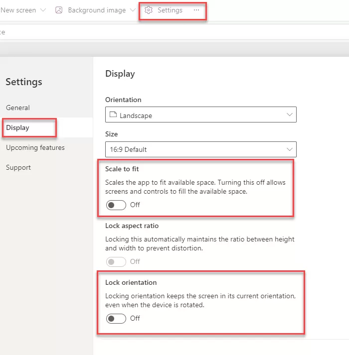
1. Open the power apps and click on the setting.
2. Go into the display settings and turn off the “Scale to fit” Make sure that “Lock Orientation” and “Lock Aspect ratio” are disabled.
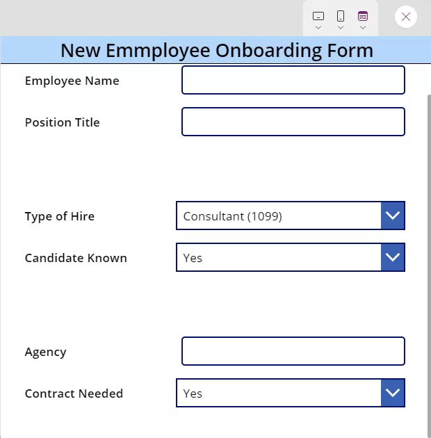
Responsive Form with individual controls.
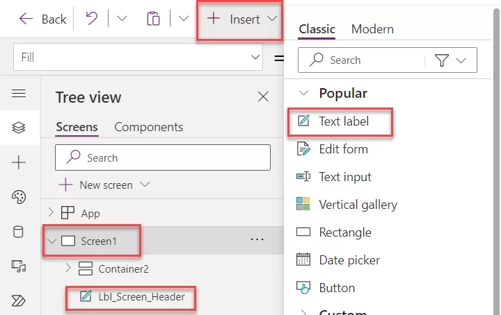
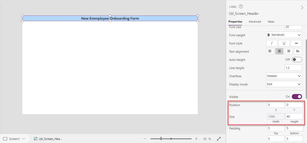
Step 1: Click on the “Insert” icon and add the Text label property as shown in the below image. And Adjust label name according to the requirement and adjust the height and width of the label. Also changes the text as per the requirement.
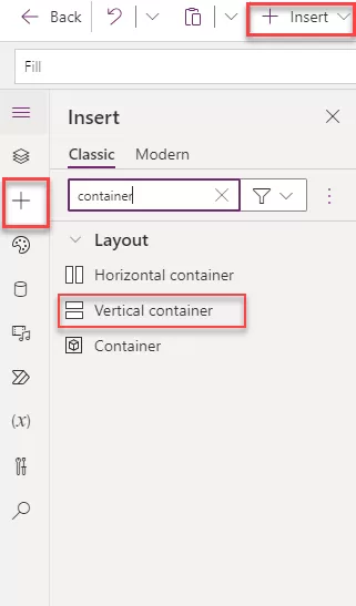
Step 2: Select the “Insert” button displayed in the image below and opt for the Vertical Container.
- We utilize the vertical container to arrange all controls sequentially, facilitating the submission of records into the data source. This arrangement allows for multiple controls to be organized vertically on the screen, enabling a smoother process for submitting records.
Step 3: Adjust the container’s X and Y position according to specific requirements. This flexibility allows for customization based on individual needs. Set the following steps based on your unique requirements.
- X position is 0
- Y Position is Lbl_Screen_Header.Y +Lbl_Screen_Header.Height
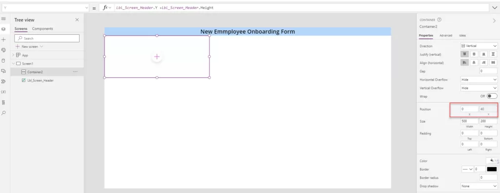
Step 4: Adjust the width and height of vertical container to fit the entire screen area. Ensure that the height and width adjustments align with the screen dimensions for optimal utilization.
Width: App.Width
Height: App.Height – Lbl_Screen_Header.Height
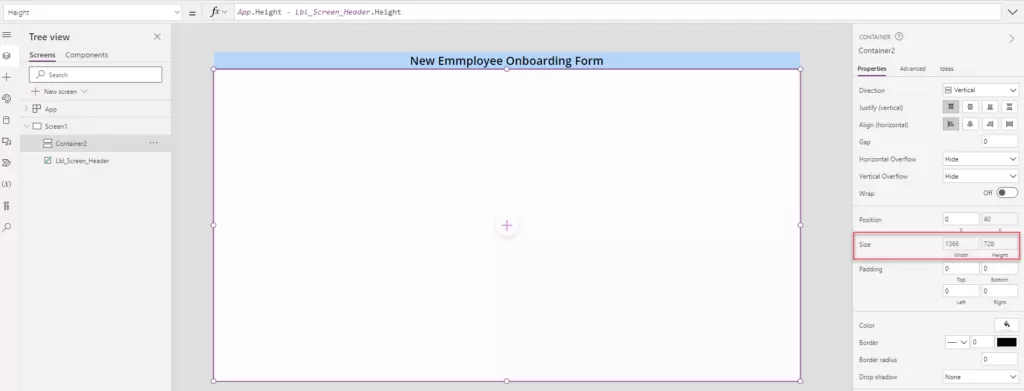
Step 5: Place a horizontal container within the vertical container to build the form with labels followed by text inputs in two parallel columns. This design will allow labels to be displayed side by side with text input areas, thus generating two columns within the form.
- When the horizontal container is added within the vertical container, it has the same width and height as the vertical container. Disable the Flexible Height option and provide a specific height based on our requirements. Set the height to 80 in this example to meet our specific needs.
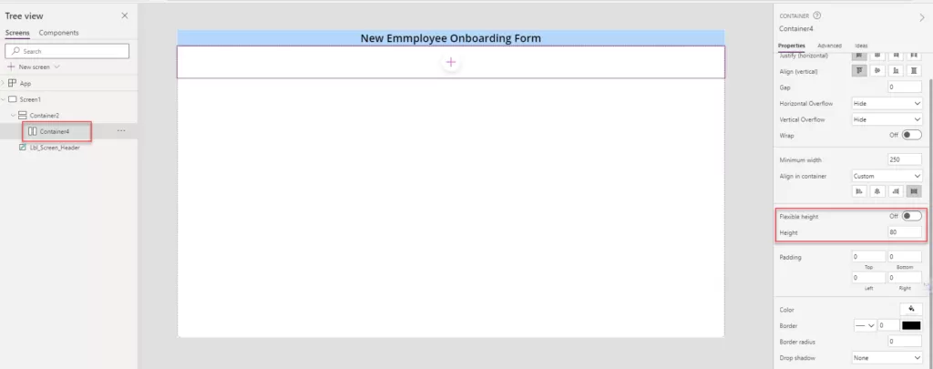
Step 6: Insert a label named “Employee Name” and a text input field for the employee’s name within the horizontal container.
- Adjust the label control properties as below.
- Flexible Width: Turn On.
- Align in Container: Custom and Stretch.
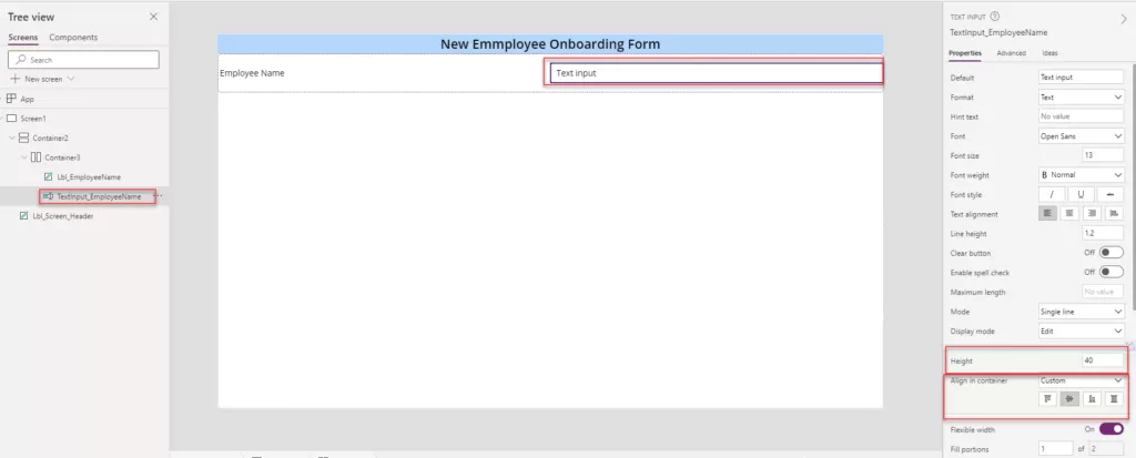
- Ensure that for the label, the flexible width is enabled, and align it within the container by stretching it to match the container’s height, as illustrated in the provided image. Additionally, add another label named “Position Title” along with its respective text input, aligning them accordingly within the container.
- While adding the text label, ensure the selected option for alignment within the container is set to “Stretch.” For all text input controls,
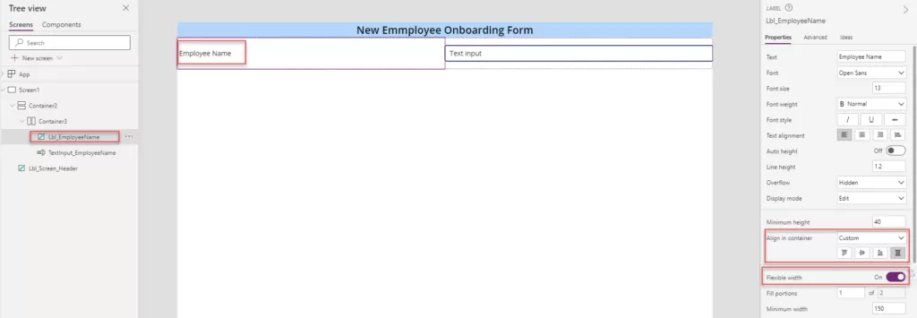
- While adding the text input label, ensure the selected option for alignment within the container is set to “Center.” For all text input controls.
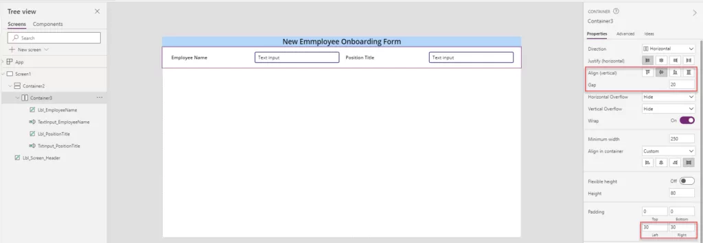
Step 7: Apply left and right padding to the container according to the desired outcome, ensuring that all controls are centered. Utilize the gap property to adjust the controls uniformly. Upon applying the Wrap property enable, the controls might shift upwards; thus, adjust the vertical alignment to center them based on the image provided.
- Padding Left and Right: 30
- Wrap toggle: On
- Align (Vertical): Center
Step 8: Implement logic for the height of the horizontal container based on screen sizes denoted by specific numbers:
- Mobile: Size 1
- Tablet: Sizes 2 and 3
- Desktop: Size 4
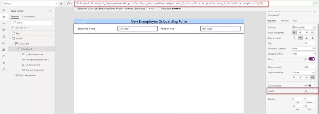
The current static height provided for Container 3 is 80. Adjust the logic for the horizontal container’s height considering these screen size specifications.
1| If(Screen1.Size<4,Lbl_EmployeeName.Height +TextInput_EmployeeName.Height +Lbl_PositionTitle.Height+Txtinput_PositionTitle.Height + 35,80) |
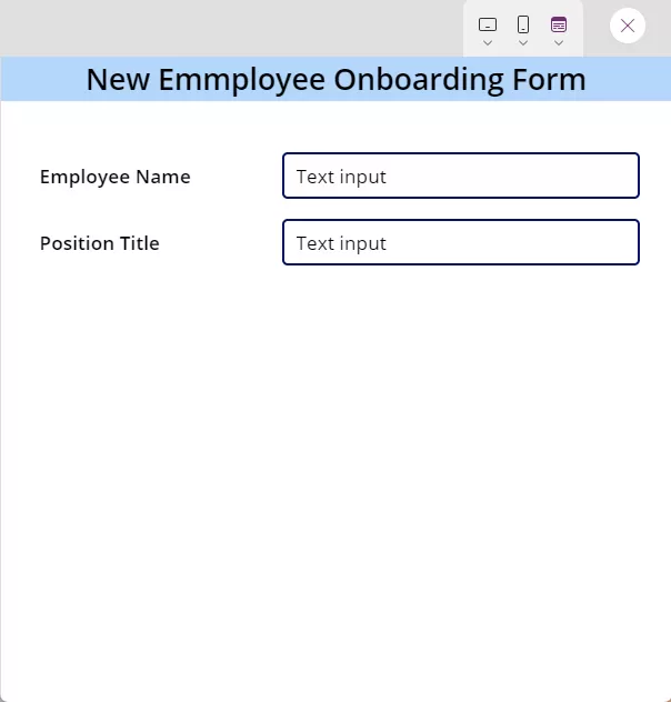
Step 9: Upon minimizing the browser window, observe how all controls automatically adapt and adjust according to the screen size, ensuring optimal responsiveness.
Step 10: To incorporate additional controls like the ones above, insert another horizontal container within the primary vertical container. Subsequently, add corresponding labels and text inputs as per your specific requirements to maintain consistency with the existing setup.
Want to talk?
Drop us a line. We are here to answer your questions 24*7.


