
Embark on a journey to enhance your Power BI reports with dynamic color adjustments based on selected measures through our informative blog. Uncover the intricacies of implementing this feature, transforming your visuals into interactive and responsive elements that effectively convey the real-time variations within your dataset.
Why Dynamic Colors?
Static reports can feel monotonous, failing to capture the nuances of your data. Dynamic colors breathe life into your visuals, instantly reflecting changes in the chosen measure. This adds a layer of interactivity and clarity, making your reports more engaging and informative for your audience.
Prepare your data:
Ensure that your measures are clearly named and readily available in your dataset. Here, prepare a spreadsheet for “Equipment Data” to represent “Equipment Type,” “Number of Units,” and “Order Value.
Load your data into PowerBI:
Go to “Get Data” under “Home” and upload your created “Equipment Data” sheet.
Create Measures according to your data:
Create two measures – one for “Number of Orders” and “Order Value in $”:
Number of Orders = COUNT(‘Product Data'[Order ID])
Order Value in $ = SUM(‘Product Data'[Order Value])
Create a parameter:
Head to the “Modeling” tab and click “New Parameter.” Choose a descriptive name (here written “Select Matrix”) and add your measures as options – “Number of Orders” and “Order Value in $”.
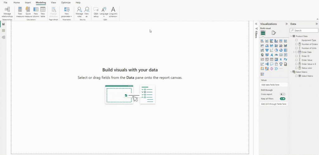
Starting with data visualization:
Take two visuals from “Visualizations”, one “Stacked Column Chart” and another “Clustered Bar Chart” to display data visually.
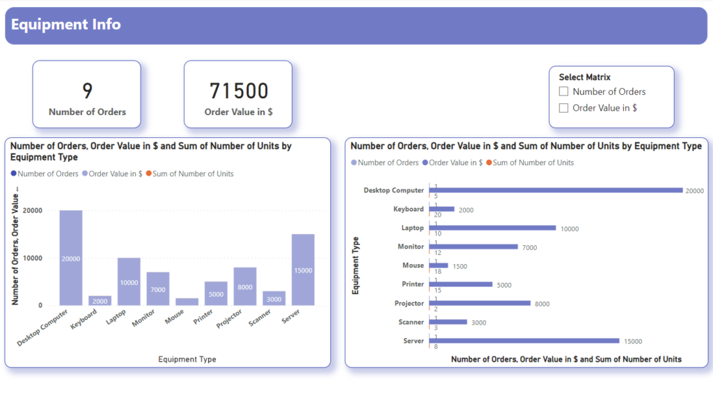
Add columns on axis: Add the created “Select Matrix” to the Y-axis for both graphs.
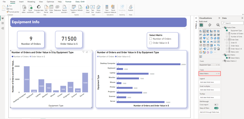
Define conditional formatting and create measures for colors:
Select your visual and open the “Format” pane. Click “Conditional Formatting” and choose “Field Value” as the formatting style.
Create measures to change the colors of visuals. You can adjust them according to your data.
Status color =
sql
Copy code
VAR selected_measure = SELECTEDVALUE(‘Select Matrix'[Select Matrix Order])
RETURN
IF(selected_measure = 0, “#909fe8”, “#2b56ba”)
Add color measure on columns:
Select the chart and go to “Visual” under the “Visualization section”. Expand “Columns” and set the default as mentioned below.
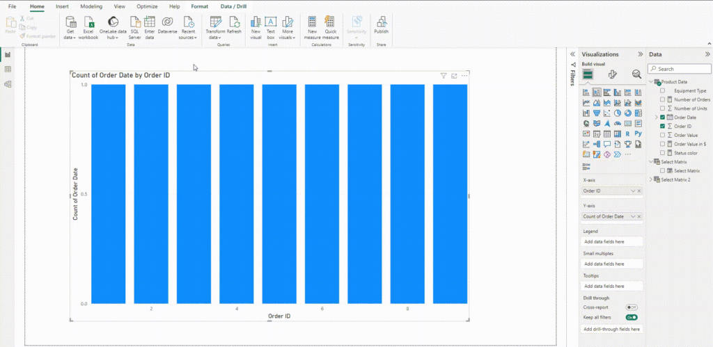
Though it is feasible to integrate all functionalities within a single measure, for the sake of simplicity, you have the option to create separate measures—one to alter the color of the Number of Orders KPI card and another to modify the color of the Order Value KPI card. This approach provides a clearer and more organized method for customizing your Power BI visuals.
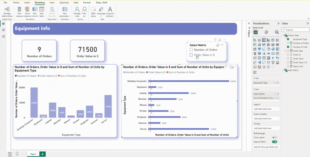
Remember, the possibilities are endless. Experiment with different color palettes, explore advanced conditional formatting techniques, and let your creativity guide you. Your reports will become not just tools for analysis, but captivating narratives that inform, engage, and inspire action.
Want to talk?
Drop us a line. We are here to answer your questions 24*7.


